Contributions

Visual Design, Brand Design, Component Design, User Research and Analysis, Video Editing

Tools

Figma, Protopie, After Effects

Team

Anna Chi, Julia N, Sarah D, Gracie G, Rishabh J.

Simplifying the rescue process of local stray animals.

Neighbourhood Rescuer

Vancouver UX Awards Finalist 🏆


Conference Presenter ⭐️

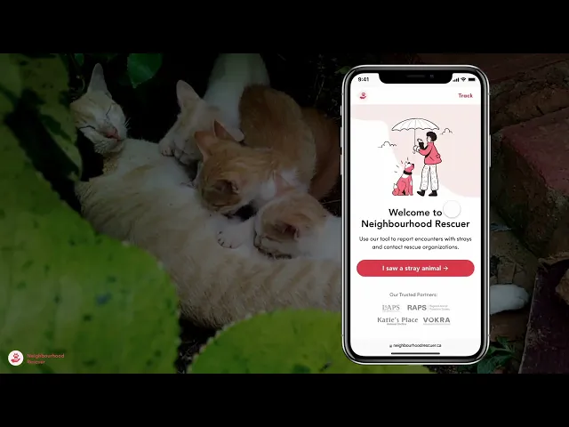
Neighbourhood Rescuer is a mobile platform that offers reliable instructions, crucial resources, and a seamless connection to experienced animal rescuers. By combining these features, it significantly enhances the success of rescue efforts and empowers people to navigate challenging situations with abandoned animals effectively.

Process

Context

I wanted to build this because I witnessed the problem.

Last summer, I came across a dog near my building... As it started raining, I decided to briefly return home to figure out a solution, but by the time I returned, the dog had disappeared. To this day, I still wonder what happened.

My Role

My industry experience helped lead the team.

I set clear timelines, goals, roles, and expectations. I introduced new technical concepts and led the creative direction of the user interface. I actively contributed to user research, testing, and synthesis.

Framing

How Might We Statement

How might we empower individuals who encounter strays to better respond to them in time of urgent need?

The Problem

Professional assistance is not always available and resources online are saturated and overwhelming.

Research

The rescue process is complex. Qualitative interviews helped us understand our stakeholders.

We conducted 1 hour qualitative interviews, with:

3

Local animal rescue organizations

2

individuals who have postered animals

2

individuals who have owned rescue animals

The animal rescue process is complex and involves collaboration among multiple stakeholders, including finders and volunteer rescuers. It was crucial for us to understand the logistical aspects of local animal rescue organizations and the types of assistance they can offer.

Main Insights

Insights gathered from interviews and research guided our decisions.

Injured Animals Take Priority

Emergency sightings and situations should be prioritized, this includes animals with injuries.

Check Animals for Identification

When individuals encounter a stray, professionals will instruct them to check for identification such as collar, tag, ear tattoos - varying across animals.

Human Safety Take Priority

The safety of the finder and rescuer should be prioritized, thus it’s important to know how to identify an aggressive animal. Additionally, all participants should be give the option to withdraw at any point.

Rescuers are usually associated with an organization

Many shelters and rescue organization workers provide help outside of work hours. They usually find these cases through Facebook groups or their networks.

Low-Fidelity Wireframing

Lo-fi wireframe helped us create the workflow of the application

Having mapped out all the features, I took the lead in creating low-fidelity grayscale wireframes for multiple components, including the diagnosis tool, rescuer connection, and the entire accompanying rescuer-facing app.

Through low-fi wire-framing, we were able to address all necessary flows and avoid getting too attached to specific ideas. This approach facilitated rapid and efficient iterations without the distraction of visual elements.

Visual Direction

I led the visual direction of the application and introduced best practices to the team.

I set up the below style guide to get the team to the next stage of high-fidelity prototyping. I provided guidance to the team on creating color, font, and effect styles for our Figma library, ensuring efficient updates and maintaining design consistency.

High Fidelity Prototyping

Based on research insights, hi-fi prototypes focused on visual design, accessibility and copywriting.

Visual Design: Given the potentially stressful situation users may experience when using Neighbourhood Rescue, it is crucial to prioritize visual design elements that communicate reliability and instill trust. Additionally, the interface should have a clean and simple design to avoid overwhelming the user further.

Accessibility: Complying with accessibility guidelines was a top priority for Neighbourhood Rescuer. We ensured high color contrast for all interface elements and carefully considered element sizes to optimize usability on mobile devices.

Copywriting: Clear and concise content played a crucial role in delivering a simple and easily understood experience to the user. We emphasized the importance of crafting content that effectively communicated information and minimized any potential confusion.

Usability Testing

18 usability tests were conducted to gather user feedback and validate design decisions.

The participants were given a pre-test survey, which gave us more background into their demographic and previous experience, and a post-test survey to understand their overall thoughts and satisfaction with the design.

Method

Where

Zoom and In person

Type of Data Collected

Think-aloud observations and direct feedback to learn about users' positive and negative thoughts and feelings.

Interface Type and Task Scenarios

  1. Urgent (animal is in distress); rescue volunteer service is dispatched; person cannot stay with the animal.

  2. Urgent (animal is in distress); person stays with animal; person transports it to a local rescue organization

  3. Non-urgent (animal is NOT in distress)

Demographic

9

Individuals who were interested in the problem space.

3

Have worked directly with rescues or shelters such as Katie’s Place Shelter, WAG, and Countryside Kennels.

6

Are either active foster guardians or own a rescued animal and are passionate for pet rescue.

Key Feedback

Number #1 takeaway was the overwhelming amount of text the user needed to read. We needed to consider what the minimum amount of key information is.

“There are too many things to read and fill out, if I'm in an emergency situation I'd be too overwhelmed to read all this. ”

— Usability Tester | Product Designer

Feature Breakdown: Finders Web App

Diagnosis Tool

The access point for Neighbourhood Rescuer can be easily found with a quick Google search. This search leads the user to its Diagnosis Tool, a crucial step in determining the type of assistance and instructions to provide.

Requesting Help

When the finder is unable to transport the animal(s) to a rescue or clinic, our system facilitates a connection to a nearby rescuer. To ensure a smooth process, the finder is required to provide their precise location, along with photos of recognizable landmarks and, if possible, the animal(s) itself.

Connecting with Rescuers

After providing all the essential information, the finder will be connected with the nearest rescuer. They will have access to valuable details such as the estimated travel time of the rescuer and the ability to communicate through messages for any further assistance required. At this stage, the finder is given the choice to leave the premises if necessary, as the rescuer has already received all the pertinent information needed to proceed with the rescue.

Moreover, the finder also has the option to sign up for email or text updates, along with a tracking number.

Tracking Cases

Once the finder has left the premises, they can use their tracking number to check for updates regarding their case, providing them with peace of mind. It's important to note that while the rescuers and rescue staff strive to provide updates, they may not always be guaranteed due to their high workload and competing priorities.

Feature Breakdown: Rescuer Mobile App

Responding to a Rescue

When a rescue is reported, nearby rescuers will be alerted, and the case will be assigned to the rescuer who responds first. Prior to accepting the case, the rescuer will have access to all the information provided by the finder. This allows the rescuer to review the details and ensure they are comfortable and well-prepared to handle the specific rescue situation.

Performing the Rescue

Upon the rescuer's response to the case, they are granted editing access to the case file, enabling them to make any necessary updates. They will also receive navigation assistance to the rescue location and have the ability to communicate with the finder through messaging, ensuring seamless updates or addressing any queries.

Once the rescue operation is successfully carried out, the rescuer will be prompted to provide information regarding the rescue organization or clinic where the animal(s) was taken.

Other App Features

In addition to the rescue flow, the app offers several other features. It includes an archive that stores records of previously completed cases by the rescuer, allowing for easy reference and review. Notifications are also incorporated to keep the rescuer informed about relevant updates and activities within the app. Furthermore, a messaging component is available to facilitate communication between rescuers, enabling them to connect and collaborate effectively.

Reflection

Projects like these make me feel so proud to be a designer, because it gives me the opportunity to create solutions to problems I have experienced and care about.

The amount of time and effort that went into this project cannot be accurately represented through a case study. The team and I went through so many scenarios and use cases, with consideration into feasibility from both user demographics through intensive user research.

This project is super personal to me, and I was estatic and proud that Neighbourhood Rescuer made it to Vancouver UX Awards as a finalist for the Students Category! Being able to share this project with so many people was an honour, and hearing feedback regarding how essential this service is was extremely inspiring and motivating.

Made with love by Anna

Made with love by Anna

Made with love by Anna