
How I championed a CoPilot AI's deisgn system project from zero to one.
Design Systems: Video by CoPilot AI
CoPilot AI is a B2B SaaS start-up focusing on LinkedIn Lead Generation. As the second designer on CoPilot AI's New Venture Team, I had the opportunity of taking on the ownership of developing CoPilot AI's first design system.
Contributions
Visual Design, Brand Design, Component Design, User Research and Analysis, Documentation
Tools
Figma, , Jira, Confluence
Team
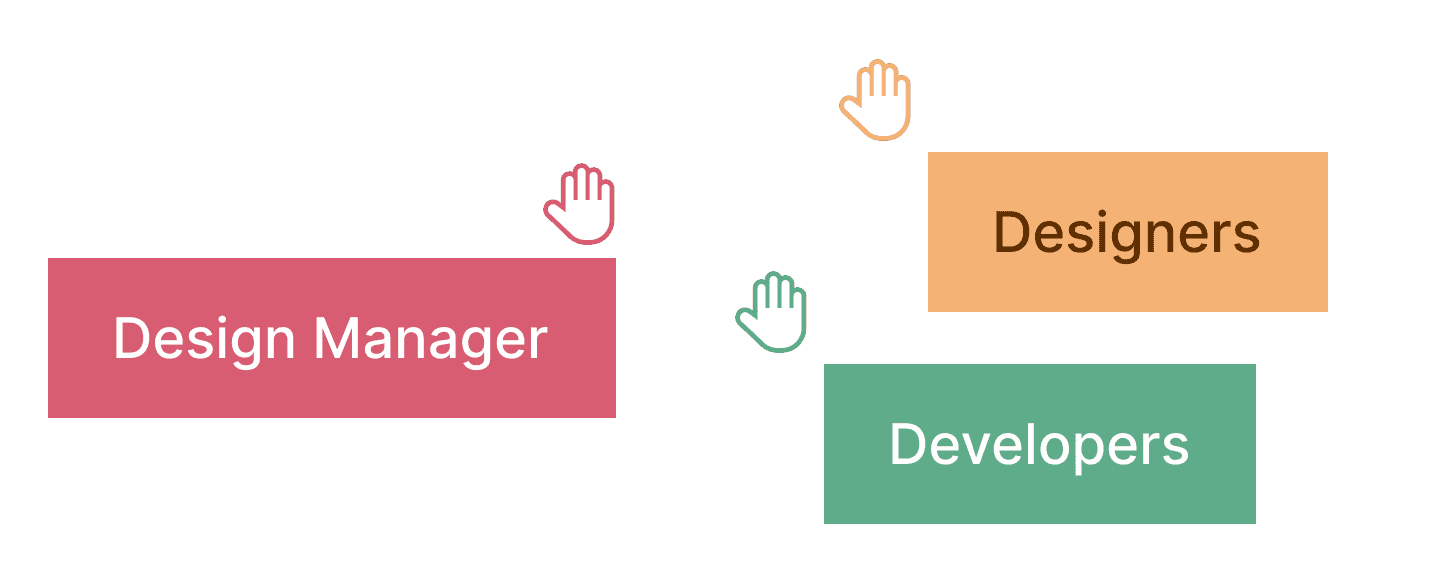
Anna Chi, Design Manager, Developers, Product Manager


THE PROBLEM
CoPilot AI's previous development process faced consistency and communication challenges without a design system.
CoPilot AI faced a significant challenge in their development process due to the absence of a design system. This caused delays and increased communication overheads between the design and development teams due to the lack of clarity in designs. Recognizing the importance of a design system, the New Venture Team made a conscious decision to implement a design system for their new product, Video by CoPilot AI, right from the start.
THE APPROACH
I modeled the design system's process after the Atomic Design method.
As our user's data catalog grew significantly in size, it became increasingly difficult to view and find files. While the existing filter functionality provided some organization, it was no longer sufficient as the volume of content increased. The lack of a higher-level organizational system created a navigation problem.


BRANDING
I generated numerous exploratory color pallettes and type combinations to iteratively come up with the product's branding.
Creating a brand for the product through color and typography was challenging. As I had no prior experience in brand design, I took an iterative approach, generating numerous exploratory color palettes and type combinations based on my prior visual design knowledge. With feedback from the team, I was able to finalize a comprehensive style guide.
BRANDING
I generated numerous exploratory color pallettes and type combinations to iteratively come up with the product's branding.


STYLE GUIDE
After establishing the brand, I set up the style guide as the foundational element of the design system.
To build a successful design system with consistent and cohesive reusable components, the first step is to establish design guidelines that provide specific directions for using design elements such as color, typography, grid system, elevation, spacing, and iconography. These elements are considered the atoms of the design system, forming the essential building blocks for the design system.
STYLE GUIDE
After establishing the brand, I set up the style guide as the foundational element of the design system.


COMPONENTS
I had to come up with an efficient method of updating 150+ button varients with consideration into scalability.
After establishing the design system's atoms, my focus shifted to creating reusable components, which formed the core of the system. It was the most challenging part of the project, requiring multiple iterations and testing to get right. The complexity of creating these components was compounded by the need to generate many variants of each one.
COMPONENTS
I had to come up with an efficient method of updating 150+ button varients with consideration into scalability.
For example, designing a button required primary, secondary, and icon variations, each with its own default, hover, selected, and disabled states. In total, I had to create over 150 button variants. Additionally, I had to develop an efficient method of updating these buttons while considering scalability in the future.
COMPONENTS
I had to come up with an efficient method of updating 150+ button varients with consideration into scalability.


PRESSURE TESTING
The design system is a tool, I conducted frequent test sessions to ensure it was easy to use.
During the project, I realized that a Design System is not just a set of guidelines, but rather a product in itself. Hence, I focused on ensuring its usability for current and future designers. To achieve this, I conducted frequent pressure testing sessions with designers in the company.
PRESSURE TESTING
The design system is a tool, I conducted frequent test sessions to ensure it was easy to use.
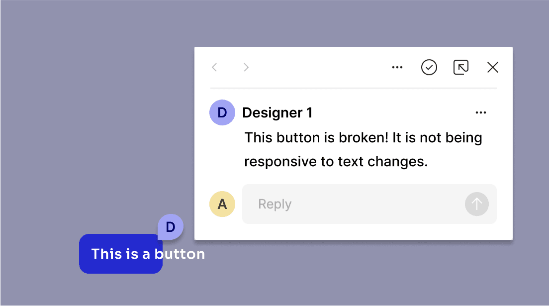

Task type 1: Editing and customizing molecule components to reveal any broken parts, bugs essentially.
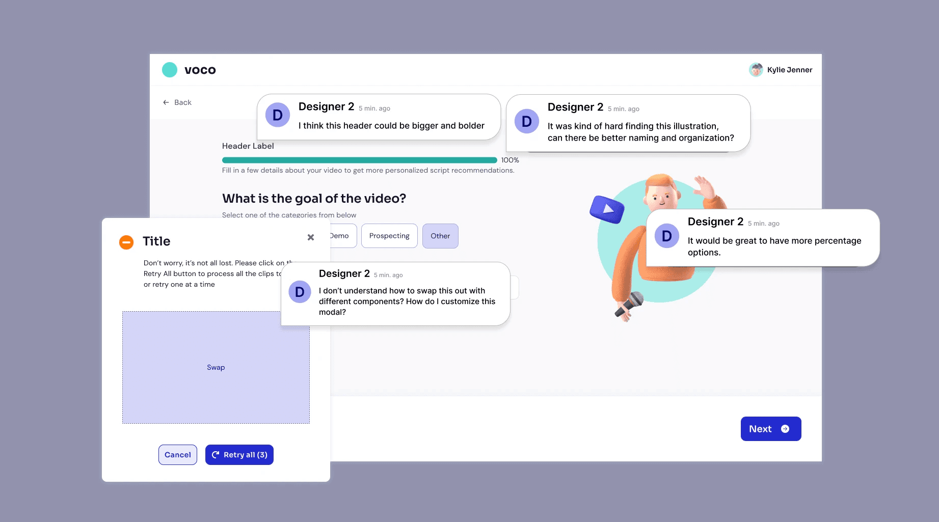
Task type 2: Recreate existing screens within the product using molecule and organism components from the design system to test usability and understandability.
EDUCATION
To advocate for its adoption, I held a company-wide webinar on Design Systems.
While working on a design system project, I came to understand that it's not enough to focus solely on its creation, but it's also critical to educate and advocate for its adoption by other stakeholders such as designers, product managers, and engineers. During my internship's final stages, I had discussions with these stakeholders to understand their perspective on implementing a design system and promoted its value to the core product team, urging them to adopt it alongside the new product.
In addition, I organized a company-wide Lunch and Learn session to educate everyone on the benefits of a design system and clear up any misconceptions.
In addition, I organized a company-wide Lunch and Learn session to educate everyone on the benefits of a design system and clear up any misconceptions.


IMPACT
The design system reached 50% adoption rate and reduced designer's timeline by 30% while promoting consistency across designs.
Currently, the development team has implemented around 50% of the design system into the the code, they’re working towards full implementation. For designers, it has reduced their design process by 30% and they now have more time to focus on larger usability problems.
“Super helpful [the design system], really useful for engineering, and people rave how easy it is to use, which I think is because of the design system.”
— Engineer Manager
RETROSPECTIVE
Consistent stakeholder communication was crucial in helping me understand what was feasible, and being able to provide input during the development process.
Developing a design system from scratch has been a tremendous amount of work, but also a tremendous learning experience. It helped me understand how crucial it is to have a design system for the effective scaling and workflow of a product and company. Moreover, it transformed the way I approach design.
LEARNINGS
Learning 1: Technical Skills
This project was a game-changer for me, as it enabled me to master new technical skills within Figma. I gained expertise in auto-layout and component creation for both small and large components, and learned how to create a scalable design system that can be adapted for the future.
Learning 2: Documentation
Although writing documentation is dry, it is crucial! Through diligent documentation updates for the design system, I was able to recall work I’ve done weeks before. This is especially important for future employees to have as a reference, helping them effectively onboard onto the project. Once again, its all about scalability!
- Thanks to the support of other designers in the company, we were able to conduct user testing and ensure that the design system was intuitive and user-friendly.
- Thanks to the support of other designers in the company, we were able to conduct user testing and ensure that the design system was intuitive and user-friendly.
- My constant communication with the developers helped me understand what was feasible, and I was able to provide input during the development process.
- My constant communication with the developers helped me understand what was feasible, and I was able to provide input during the development process.
- When I encountered blockers, I always had the support of my manager to help me overcome them.
- When I encountered blockers, I always had the support of my manager to help me overcome them.
💕 Special shoutout to my manager, Trupti, for guiding me on this journey and giving me all her knowledge on design systems. 💕
💕 Special shoutout to my manager, Trupti, for guiding me on this journey and giving me all her knowledge on design systems. 💕
